Mode Choc
Design
La Firme
CabinetMaking
Lighting
Éclairage Raymond
Production
2017
Photo
Design for retail optimization
In redefining this big box store’s client experience, it was imperative to avoid the aesthetic ruts in decor and signage that its competitors frequently fall into.
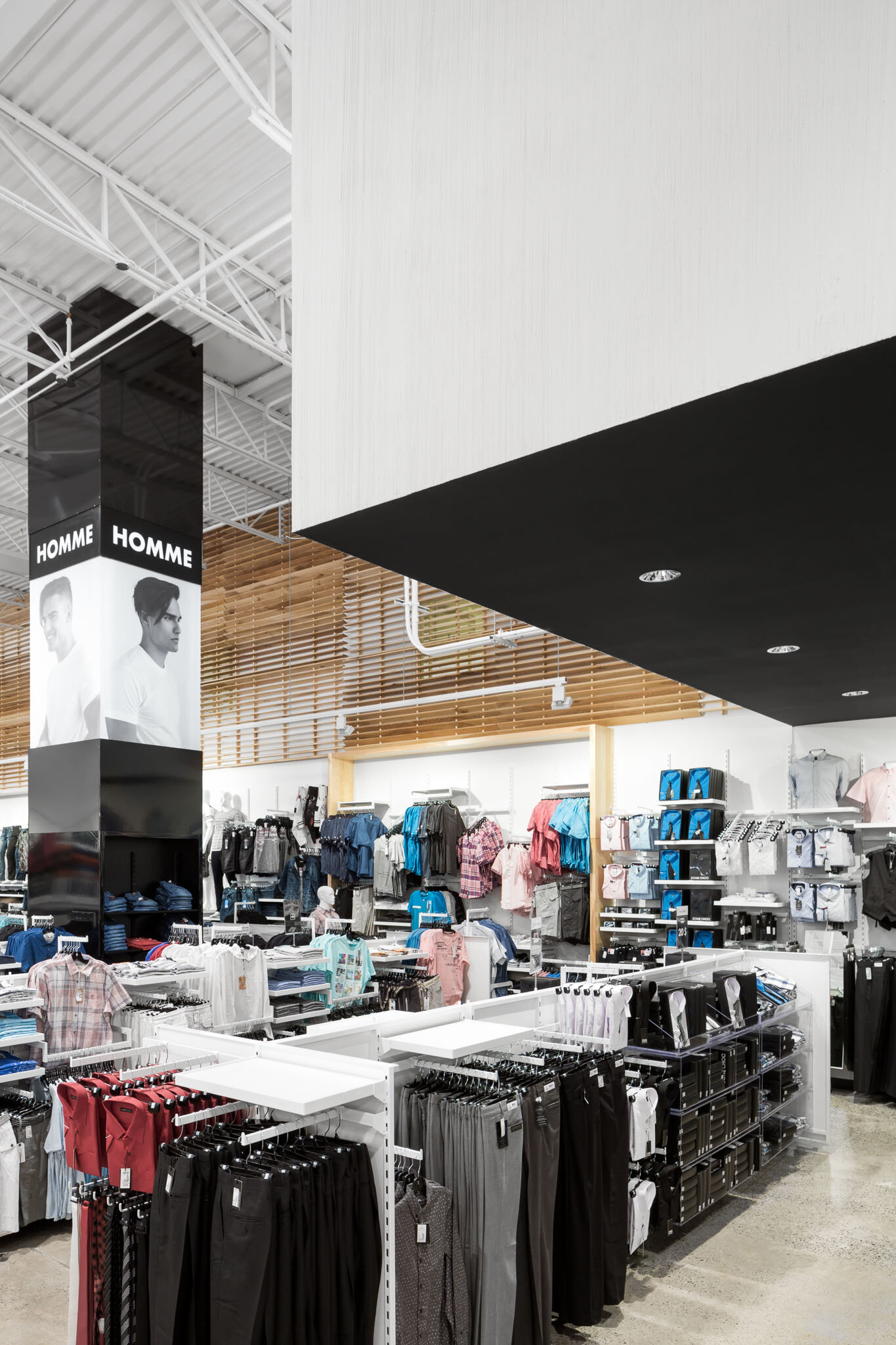
The store layout was streamlined, made-to-measure furniture that serves the brand image was created, and bold, original signage make the store easier to read and navigate.
Space as product stage / filling a space with content
If retail space is a medium, product is its content, and every square inch matters. With Mode Choc, space serves product. Key elements, like lighting and aisles that ease shoppers’ access to more intimate, boutique-like zones with their own product focus, bring the notion to life.
Two layers of carpeting and several centimeters of ceramic hid a concrete slab floor that was repaired, polished, and sealed. The walls and accents, in birch, a local wood, bring great color variations, enlivening an otherwise industrial setup.


